Shortened gif of final data visual
Student Project: Air Quality Monitoring and Data Visualization
Design Category: Technology Prototyping, Data Visualization
Tools: Arduino, Adafruit BME 680 Sensor, Processing 3, Illustrator
Recent awareness surrounding air quality fluctuations and monitoring techniques inspired me to do a test of my own. I discovered air quality is not determined by neighborhood or location but differs block by block, house by house. I decided to compare and contrast different rooms in my house using an arduino and a sensor specifically designed to detect Volatile Organic Compounds (VOCs).
Sources of Indoor Air Pollutants
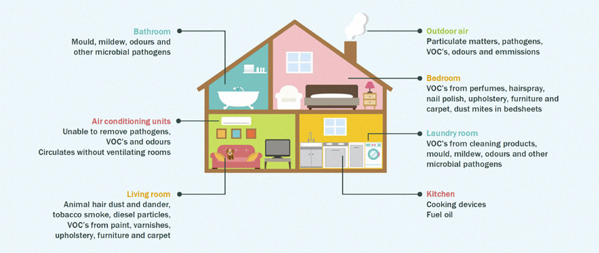
Image Source EPA.gov
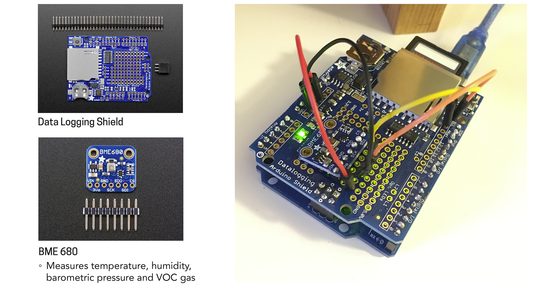
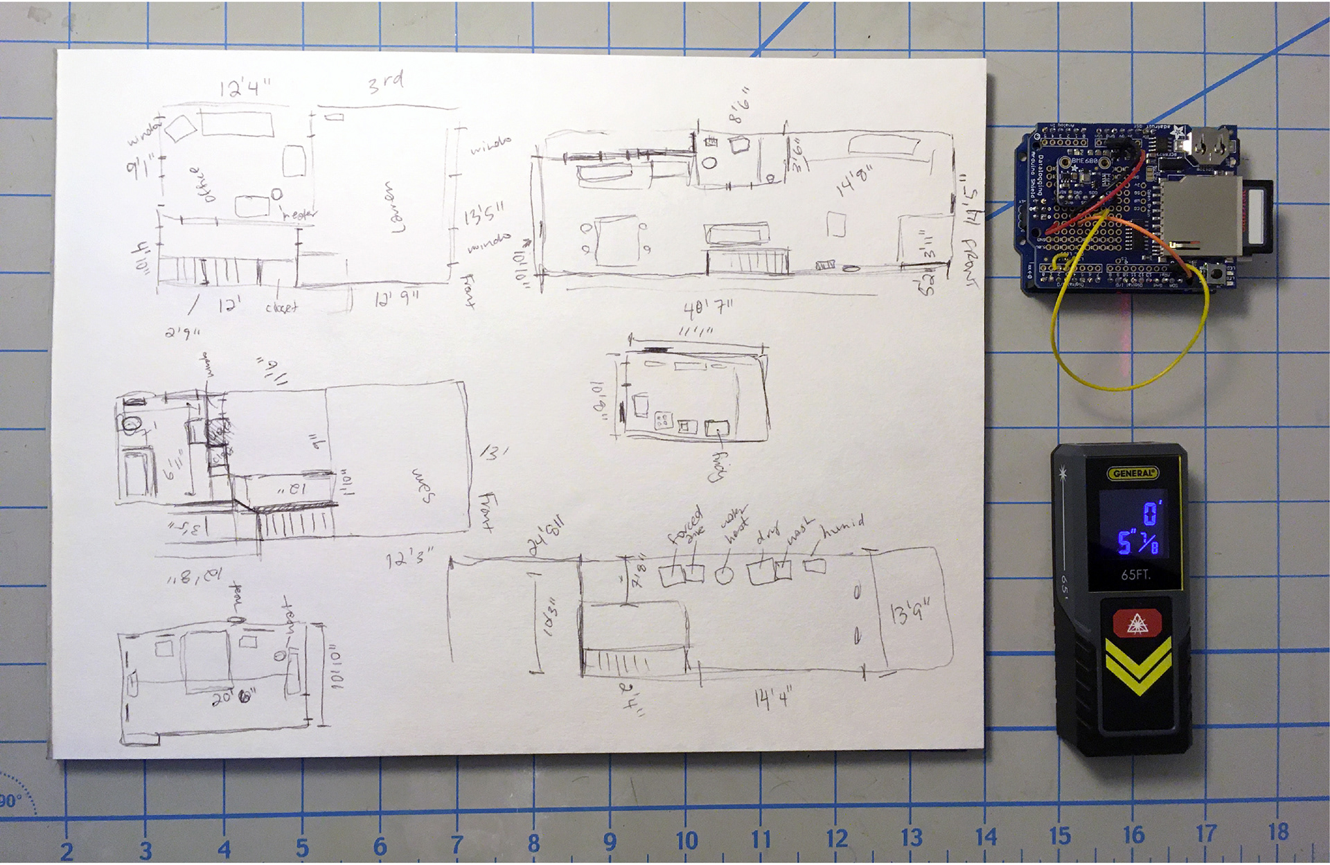
Device Components
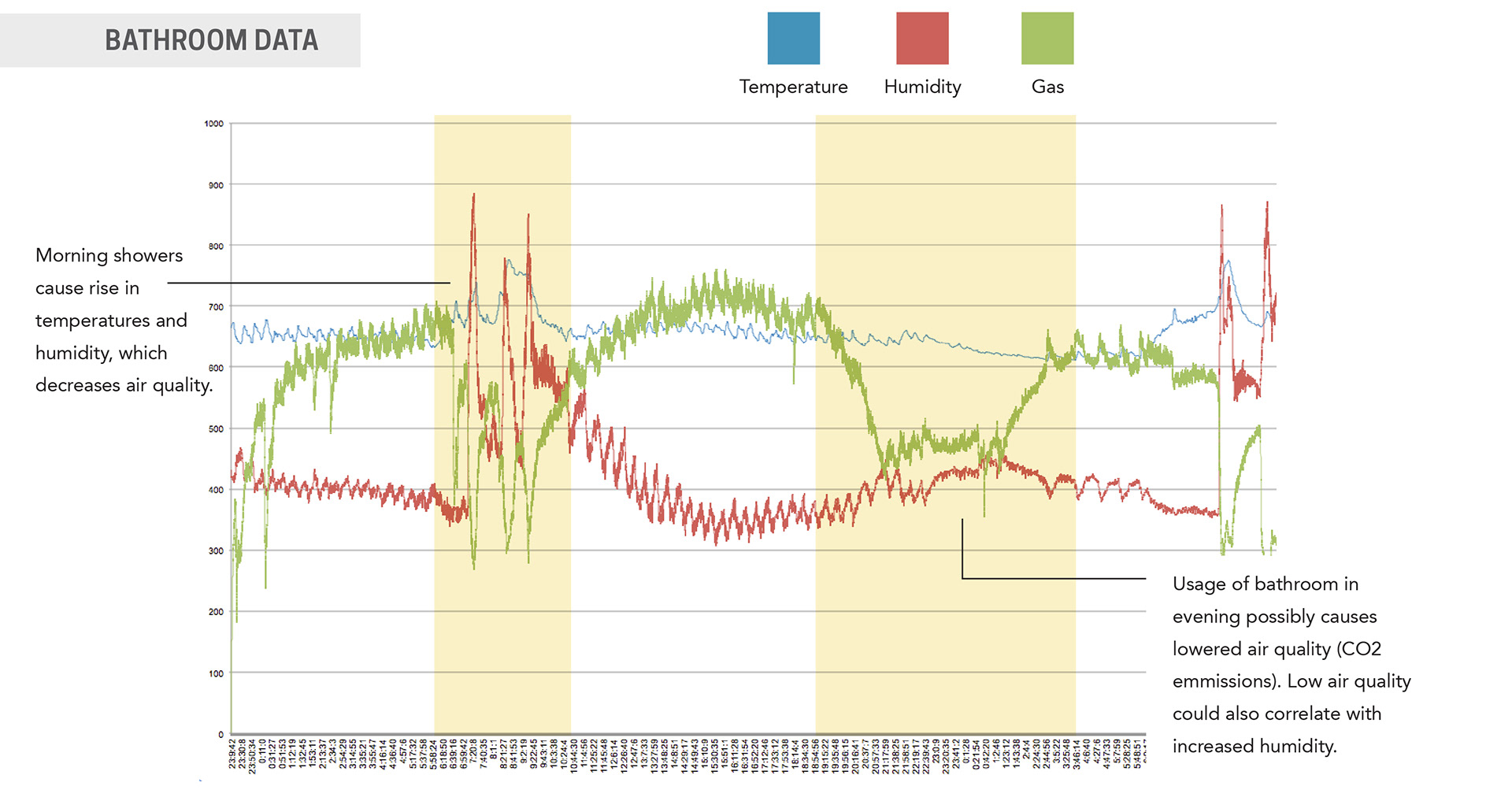
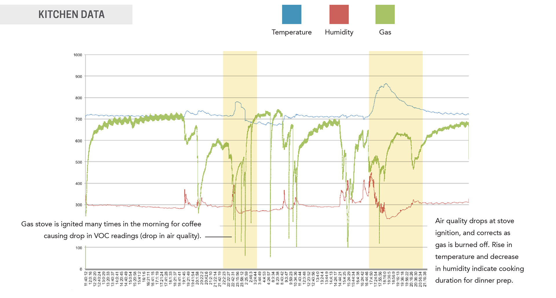
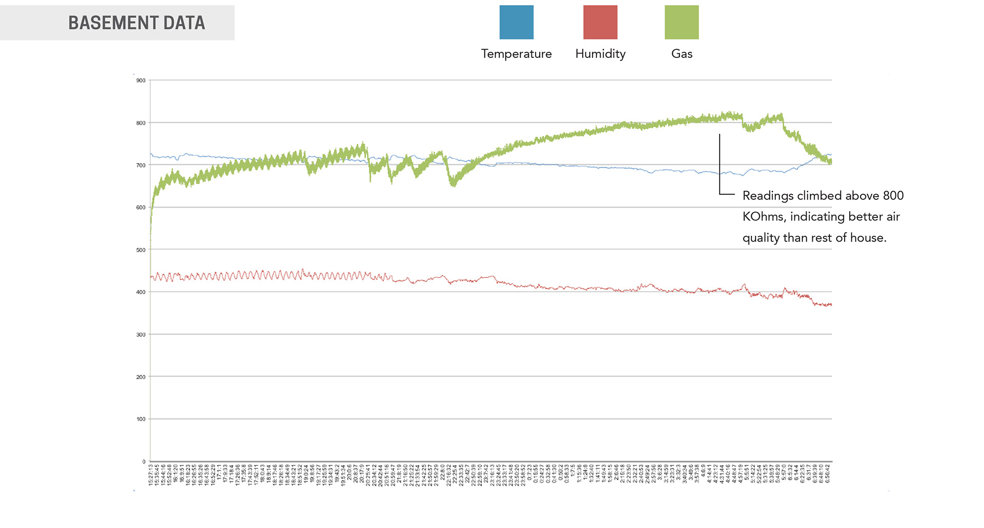
Graph Results
Once I had the device assembled and working properly, I began testing by placing the device in various areas of my house. Each location recorded for 48 hours, with testing spanning over 2 weeks. I lived in a South Philadelphia row home with 4 people and 2 dogs, giving the device plenty of activity to track.
I took the results from the readings and compiled them into excel docs to achieve the graph readings shown below.
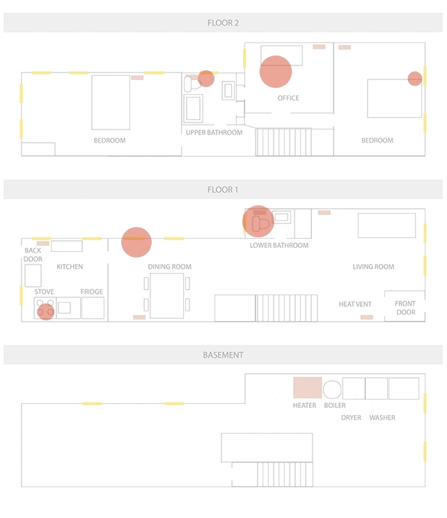
Prep for Data Visual
Room size measurements were taken of the entire house using a laser measuring tool and subsequently graphed in Adobe Illustrator.
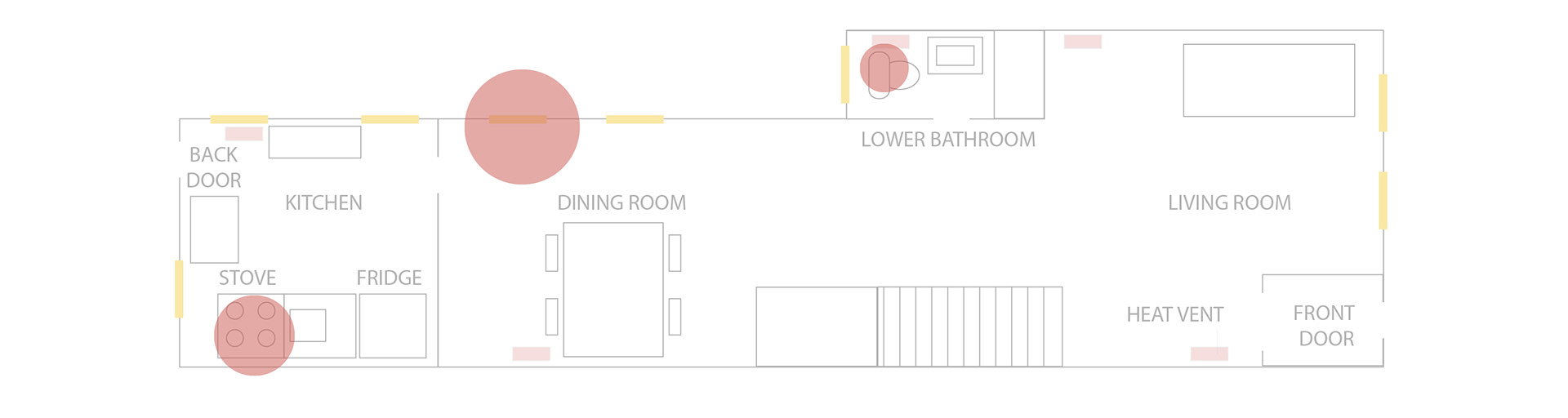
Once all code was written in Processing 3, the recorded data was mapped over the floor plan of the house. The animation shows several red bubbles indicating the fluctuating gas readings taken in each room - small represents good air quality, large connotes bad air quality or an increase in VOCs.
The kitchen and the bathroom showed the highest rates of fluctuation of gases, temperature and humidity due to cooking and showering.